Creating a podcast cover.
Dimensions, requirements, tools and examples for a cover that stands out in the app.
Scroll through the podcast charts on your phone. You decide in one second what to tap, based on an image hardly bigger than your thumbnail. That is exactly how your future listeners decide about your podcast before they have heard a single word from you.
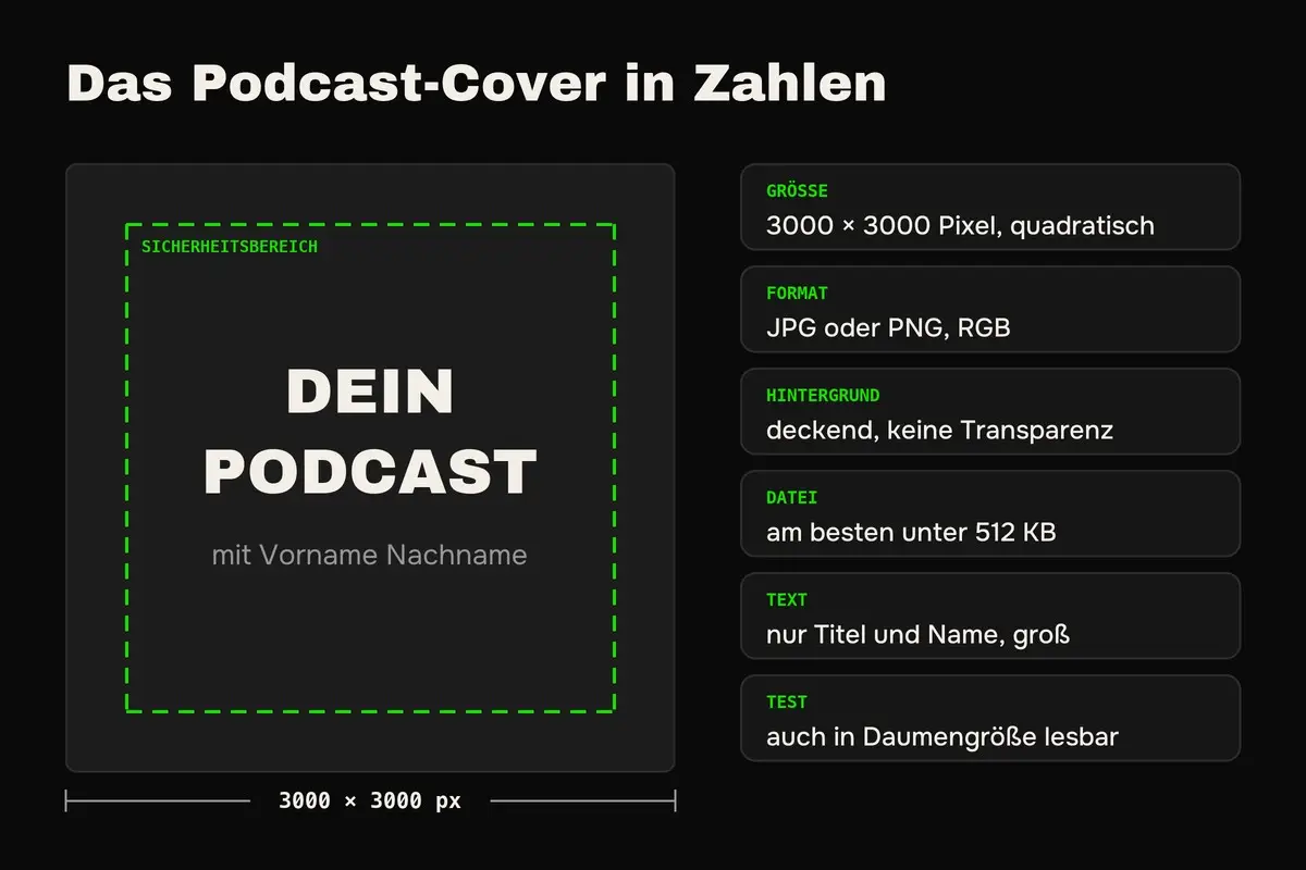
The short answer is this. A good podcast cover is square, 3000 × 3000 pixels, saved as JPG or PNG and has an opaque background without transparency. On it belong your podcast title, large and easy to read, and at most your name. Nothing more is needed, and that is exactly the art.
In this article I show you how to create your podcast cover, what Apple, Spotify and YouTube require and which tools help you.
Creating a podcast cover in 5 steps
Before we go into detail, here is the process at a glance.
- Clarify title and message: What should someone understand about your podcast in one second?
- Choose image or graphic: A photo of you, an illustration or pure typography.
- Set colors and font: Matching your branding and easy to read.
- Design the cover: At 3000 × 3000 pixels, with Canva, Adobe Express or through a designer.
- Test at small size and upload: Only once it works at thumb size does it go to your host.
The requirements for your podcast cover
You upload your cover once to your host, and from there it lands via RSS feed on Apple, Spotify and all other apps. So you design it to the strictest requirements, and those are Apple’s. For YouTube you need a separate version because you upload the image there directly.
| Platform | Size | Format | Special |
|---|---|---|---|
| Apple Podcasts | 3000 × 3000 pixels recommended, at least 1400 × 1400 | JPG or PNG | No transparency, no Apple logos or Apple devices |
| Spotify | square, 3000 × 3000 pixels is safe | JPG or PNG | Takes the cover from your RSS feed |
| YouTube | 1280 × 1280 pixels, square | JPG, PNG or GIF | Uploaded in YouTube Studio for the podcast playlist |
Sources Apple and YouTube (double-check before uploading). Many hosts additionally recommend keeping the file under 512 KB.
What belongs on a podcast cover?
Your podcast title belongs on your cover, and large. Plus at most your name and an image that immediately shows what it is about. Everything else, meaning subtitle, topic list or website, belongs in the description, because in the app your cover is often only a few millimeters in size.
With a business podcast, you yourself are the strongest subject. A photo of you creates closeness immediately, and whoever later sees you on LinkedIn or at a talk recognizes you. Also keep important elements a bit away from the edge, because some apps crop the image slightly or overlay controls on it.
One cliché you should avoid: microphones, headphones and sound waves. People already know it is a podcast, they are in a podcast app after all. The exception is a podcast that is really about audio technology.



Three covers from podcasts by Studio M clients: Fortunalista, Dein Höhenweg and PreSales Unleashed.
At Fortunalista, Margarethe is at the center, plus title and topic in a short phrase, finance for women. Dein Höhenweg works without a face, but with a strong image from equestrian sport and the topic as a big line. And at PreSales Unleashed you see Tim and Jan, plus a title that is still legible even tiny. Three different approaches, and all three are instantly recognizable in the app.
Colors and font for your cover
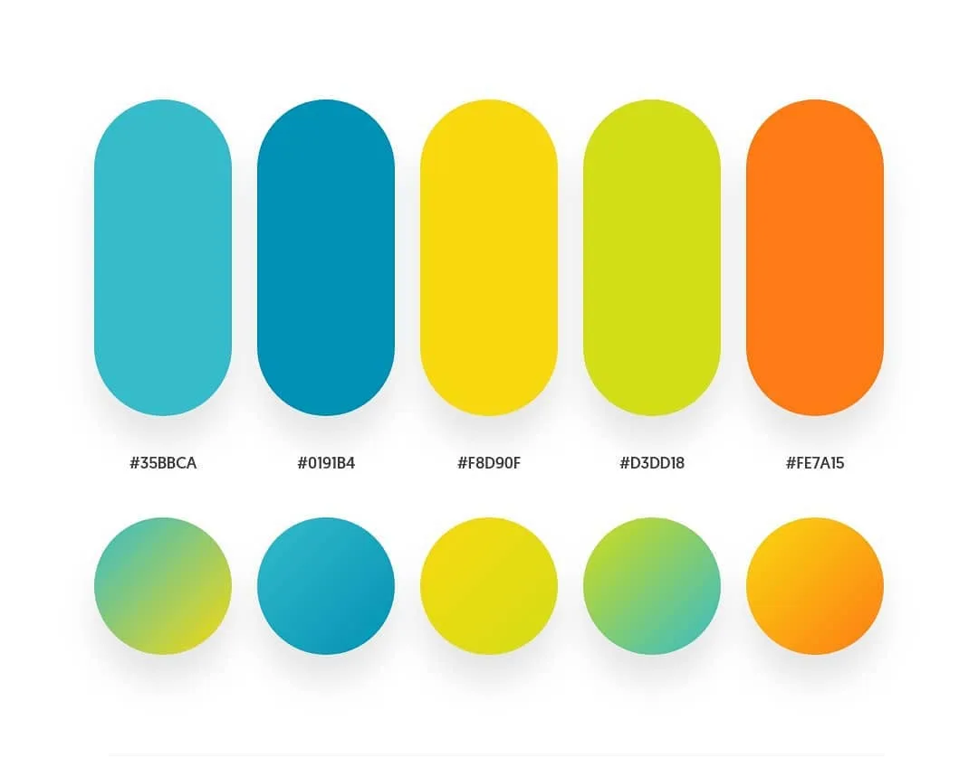
Use your brand colors so your podcast matches your website, your social media profiles and your appearance. More important than the individual color is contrast. Light text on a dark background or dark text on a light background is legible even at thumb size, pastel on pastel is not. By the way, Apple advises choosing a slightly different shade for a black or white background.
The same goes for the font. Choose a bold, clear font and at most two different ones. Ornate scripts and very thin lines disappear at small size. Free fonts you may also use commercially are available at Google Fonts. If your brand has its own font, check whether it is still legible small, otherwise take a similar, clearer one.
The thumb test before uploading
Before you upload your cover, shrink it on your phone to the size of a thumbnail. Can you still read the title? Can you tell what it is about? If not, there is too much text on it, the font is too thin or the contrast too weak. Put it next to the covers of the best-known podcasts on your topic for comparison. It should stand out from them and still fit the category.
These tools let you create your podcast cover
For starting out, a free tool is enough. Canva is the easiest way. You create a design at 3000 × 3000 pixels and use one of the many templates as a starting point. Adobe Express works similarly. Both have free versions; for some templates and features you need a subscription.
AI image generators like ChatGPT or Midjourney help you with backgrounds and illustrations. But better place the title on it yourself in Canva, because these tools often generate text with errors. And if you want it really professional, hand the cover to a designer. Depending on experience and scope, expect several hundred to about €1,000, as described in the article on the cost of a podcast .
Common mistakes with the podcast cover
The most common mistake is too much text. Subtitle, episode topics and website address make the cover illegible at small size. Also common is an image that is too small, for example 1400 pixels, which looks blurry on large screens and TVs. And then there is the PNG file with a transparent background, which Apple rejects. So always save your cover with an opaque background.
A final mistake concerns the brand. Whoever changes the cover every few months loses recognition. Take the time once, do it right and then stick with it.
Bonus
Your own artwork for every episode
Your cover is not the only chance to stand out. Apple and Spotify allow separate artwork for every single episode, in addition to the cover. Apple calls that episode art and itself writes that it should highlight changing topics and guests.
Picture the list of your episodes in the app. With almost all podcasts, the same cover sits there twenty times in a row. With you, instead, you see the face of your guest or the topic of the episode. That stands out, and it makes people want to click on a specific episode.
Here is how. In Canva, create a template in the same size as your cover, with a fixed frame in your colors and space for a photo and a short line. For every episode you only swap photo and line and upload the artwork at your host for the episode. On Spotify this also works directly in Spotify for Creators.
That costs you a few minutes per episode, and almost nobody does it. That is exactly why it works.
Conclusion on the podcast cover
A good podcast cover is simple. Square, 3000 × 3000 pixels, JPG or PNG without transparency, a large title, your name and an image that immediately shows what it is about. Test it at thumb size before uploading, and then stick with it so your listeners recognize you.
Frequently asked questions about the podcast cover
A podcast cover is square and ideally 3000 × 3000 pixels. Apple accepts at least 1400 × 1400 pixels but recommends the largest variant. For YouTube you additionally need a cover at 1280 × 1280 pixels.
Save it as JPG or PNG in the RGB color space. The cover must not have transparency. Many hosts also recommend a file size under 512 KB, for which JPG is best suited.
Yes, with Canva or Adobe Express you can create a podcast cover in the free version. Make sure you use photos and fonts you are allowed to use commercially.
The podcast title, large and easy to read, plus at most your name and an image that shows the topic. All further information belongs in your podcast’s description.